
Monday, November 27, 2006
Friday, November 24, 2006
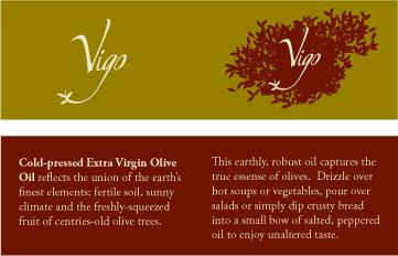
a beautiful brand
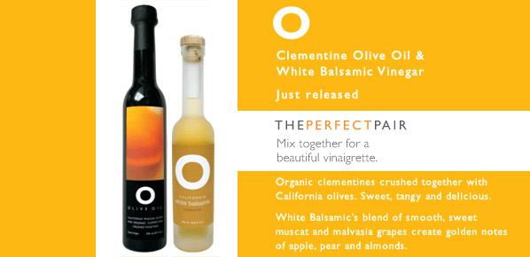
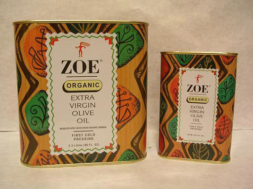
i saw this brand, O Olive Oil,at Whole Foods the other day when I was freaking out about my design. very simple and beautiful. their website also has pictures of the olive oil process from picking olives to the crushing and oil gushing out.
Wednesday, November 22, 2006
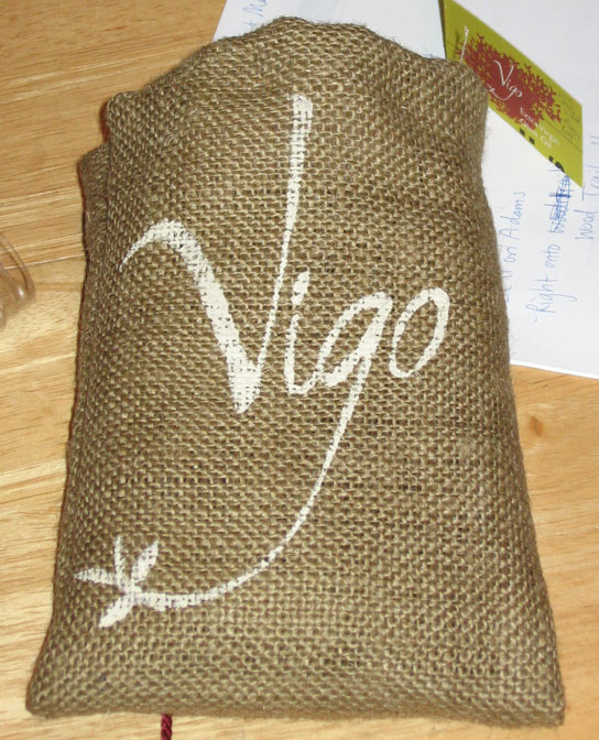
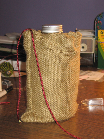
burlap booty sack
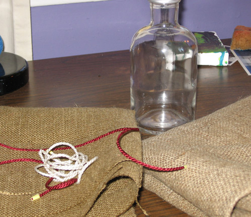
burlap is every bit as unforgiving, stiff, and itchy as they say, but also rather beautiful in an organic way. hopefully this little sack will do for the olive oil. now i have to figure out how to get the logo on the outside.
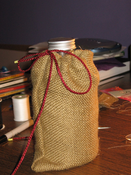
what i'm going with for now
added some imagery and started working on a booklet for the rest of the information.
Monday, November 20, 2006
Sunday, November 19, 2006
Tuesday, November 14, 2006
vigo, spain
Did a little more searching and found out that Vigo is a city in Spain, in the Galicia region. could be the 14th largest city in all of Spain. they do a lot of fishing and car manufacturing.
Vigo most likely comes from the Latin vicus meaning "small town outside a Roman fort" the city was built on top of a Celtic village and a Roman settlement (http://www.vigo.com/s/vigo/history.html)
completely unrelated, there's a Canadian company, Vigo Productions, that makes neat cards and wallpaper.
Sunday, November 12, 2006
more indecision
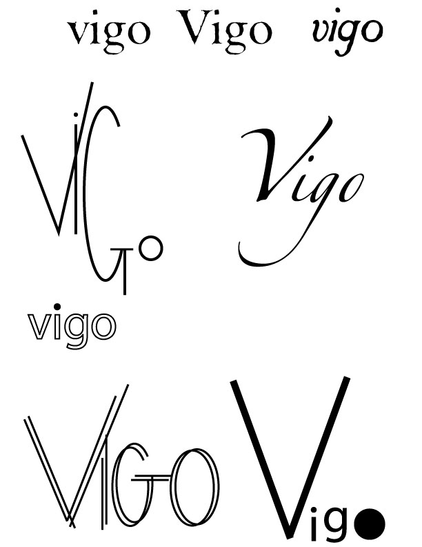
so, after i chose a new bottle, i find so many great things about the old one. i'll have to decide tonight, but started working on logos. i'm leaning towards the one that uses Zapfino. i altered the "o" and "g." i may use an illustration, so i'll have to see which goes best with that too.
Saturday, November 11, 2006
chip kidd
on thursday night, i went to see the chip kidd lecture at the portfolio center.
i had no idea he was so funny and it was refreshing to see that even someone as prolific as himself runs has trouble coming up with ideas.
he didn't impart a lot of advise as far as designing goes, but he did recommend doing crossword puzzles because they make you think creatively.
we got to see some film and book covers that never got used including one for the movie "stranger than fiction." i must say, i liked his design more, but i may have a bias.
peeling labels
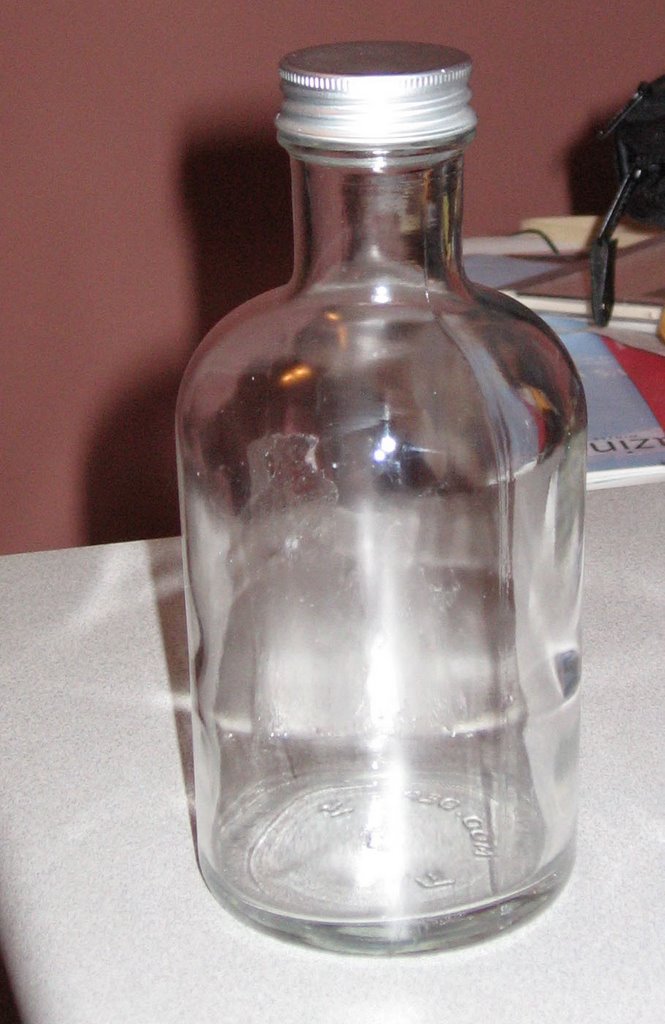
after inspecting my bottle further, i realized it's curved in three ways. Faron from Color Comps mentioned that may be difficult for a transfer, so i went out and found new bottles.
i heated them in the oven at about 400degrees and the labels peeled off very quickly once i started a corner. Rubbing alcohol got off most of the label goo, but i'll get some "Goo Be Gone" tomorrow to get the rest.
Thursday, November 02, 2006
martin venezky
martin venezky is an awesome designer. i checked out his book "it is beautiful...then gone" from the library and dreamed of type. maybe we'll see him in the near future? right now he heads up appetite engineers
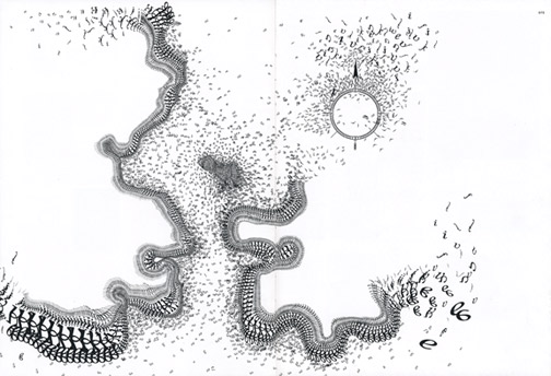
this entire image is made out of type. it's for Open 5, a publication he art directed for the San Francisco Museum of Modern Art.
Subscribe to:
Posts (Atom)