hopefully this works

Thursday, December 14, 2006
Monday, November 27, 2006
Friday, November 24, 2006
a beautiful brand
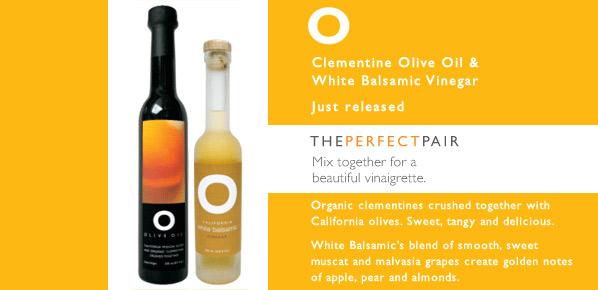
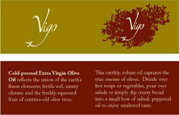
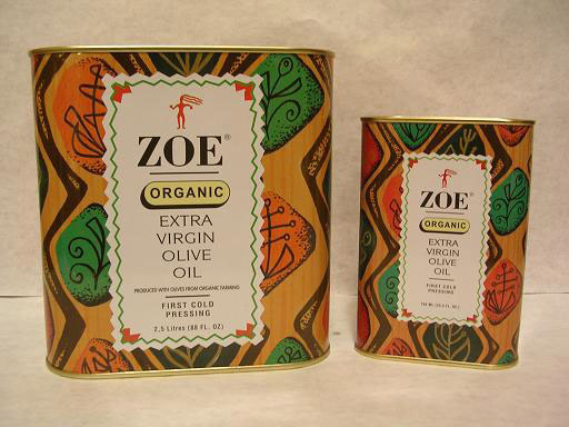
i saw this brand, O Olive Oil,at Whole Foods the other day when I was freaking out about my design. very simple and beautiful. their website also has pictures of the olive oil process from picking olives to the crushing and oil gushing out.
Wednesday, November 22, 2006
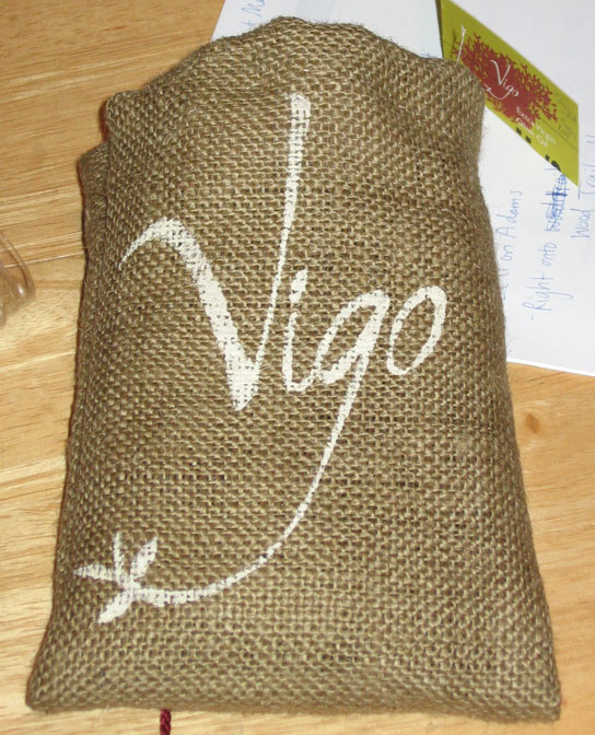
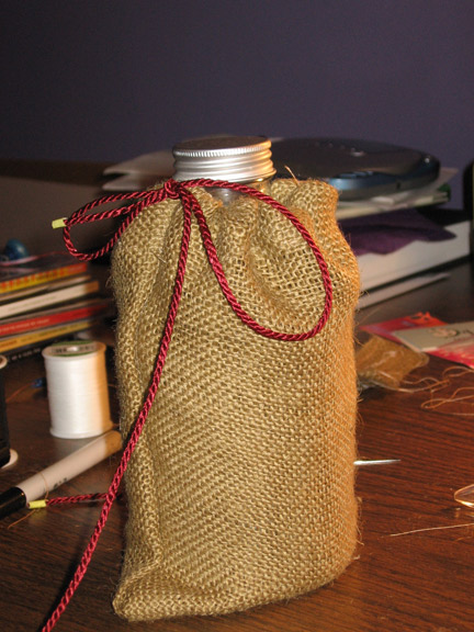
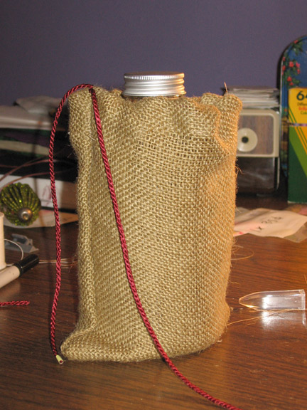
burlap booty sack
burlap is every bit as unforgiving, stiff, and itchy as they say, but also rather beautiful in an organic way. hopefully this little sack will do for the olive oil. now i have to figure out how to get the logo on the outside.
what i'm going with for now
added some imagery and started working on a booklet for the rest of the information.
Monday, November 20, 2006
Sunday, November 19, 2006
Tuesday, November 14, 2006
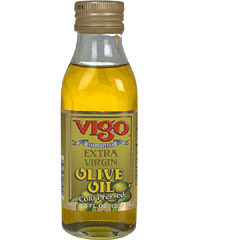
vigo, spain
Did a little more searching and found out that Vigo is a city in Spain, in the Galicia region. could be the 14th largest city in all of Spain. they do a lot of fishing and car manufacturing.
Vigo most likely comes from the Latin vicus meaning "small town outside a Roman fort" the city was built on top of a Celtic village and a Roman settlement (http://www.vigo.com/s/vigo/history.html)
completely unrelated, there's a Canadian company, Vigo Productions, that makes neat cards and wallpaper.
Sunday, November 12, 2006
more indecision
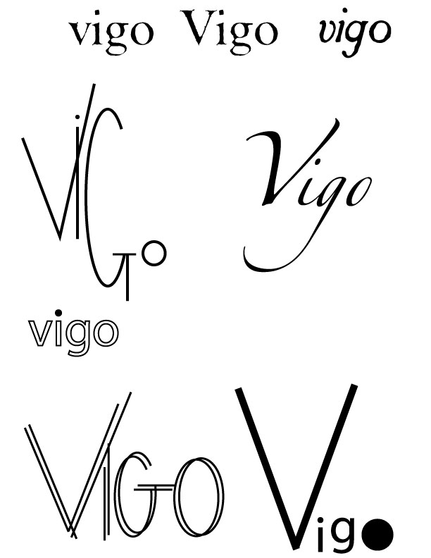
so, after i chose a new bottle, i find so many great things about the old one. i'll have to decide tonight, but started working on logos. i'm leaning towards the one that uses Zapfino. i altered the "o" and "g." i may use an illustration, so i'll have to see which goes best with that too.
Saturday, November 11, 2006
chip kidd
on thursday night, i went to see the chip kidd lecture at the portfolio center.
i had no idea he was so funny and it was refreshing to see that even someone as prolific as himself runs has trouble coming up with ideas.
he didn't impart a lot of advise as far as designing goes, but he did recommend doing crossword puzzles because they make you think creatively.
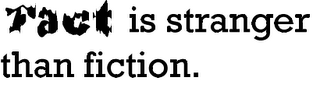
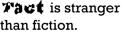
we got to see some film and book covers that never got used including one for the movie "stranger than fiction." i must say, i liked his design more, but i may have a bias.
i had no idea he was so funny and it was refreshing to see that even someone as prolific as himself runs has trouble coming up with ideas.
he didn't impart a lot of advise as far as designing goes, but he did recommend doing crossword puzzles because they make you think creatively.
we got to see some film and book covers that never got used including one for the movie "stranger than fiction." i must say, i liked his design more, but i may have a bias.
peeling labels
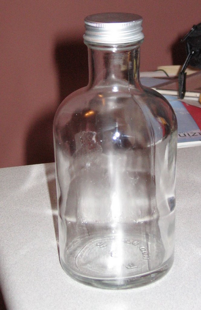
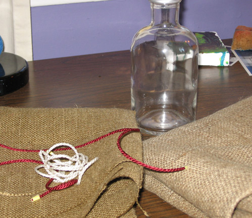
after inspecting my bottle further, i realized it's curved in three ways. Faron from Color Comps mentioned that may be difficult for a transfer, so i went out and found new bottles.
i heated them in the oven at about 400degrees and the labels peeled off very quickly once i started a corner. Rubbing alcohol got off most of the label goo, but i'll get some "Goo Be Gone" tomorrow to get the rest.
Thursday, November 02, 2006
martin venezky
martin venezky is an awesome designer. i checked out his book "it is beautiful...then gone" from the library and dreamed of type. maybe we'll see him in the near future? right now he heads up appetite engineers
this entire image is made out of type. it's for Open 5, a publication he art directed for the San Francisco Museum of Modern Art.
Saturday, October 28, 2006
Monday, October 16, 2006
Sunday, October 15, 2006
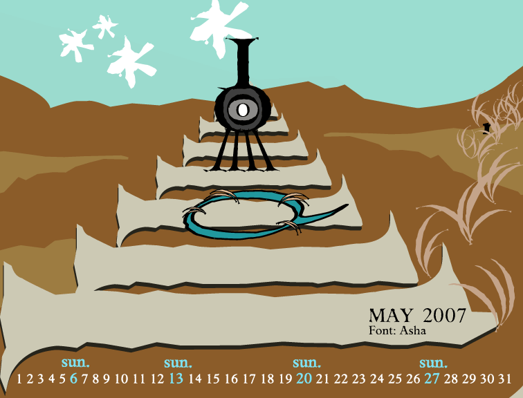
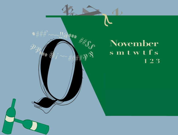
tree rings
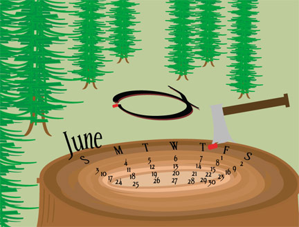
for this one i decided to emphasize the calendar part more than the murder.
still may need to space out the numbers
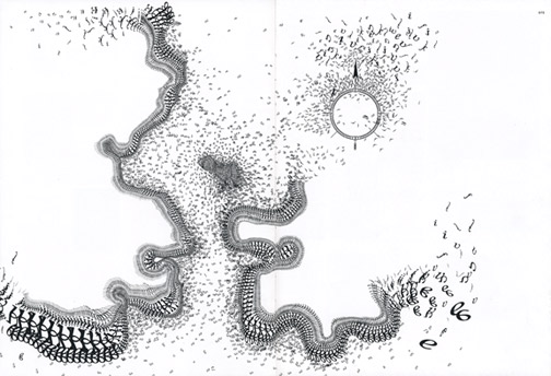
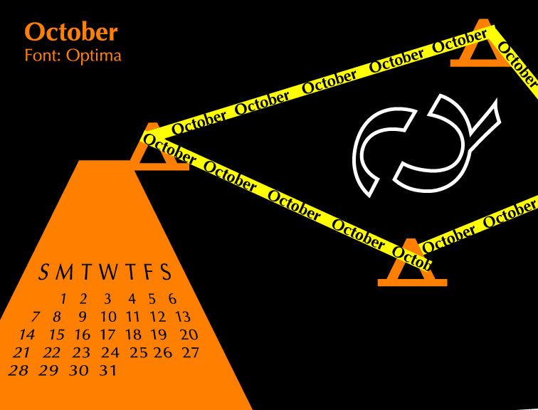
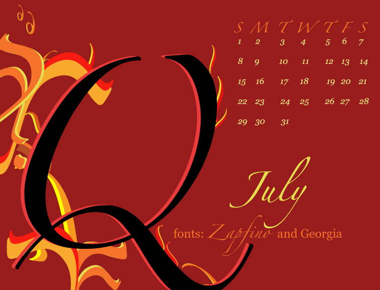
electricution
i hope this communicates well. the hardest part is making the Q look like it's getting shocked.
Thursday, October 12, 2006
art and design converge
Tonight Red Bull hosted the preview party for the Art of the Can
my friend got me in and there was some cute stuff in there. a huge guitar made out of cans, a chess board, necklaces. my favorite was an elephant made out of cans.
my friend got me in and there was some cute stuff in there. a huge guitar made out of cans, a chess board, necklaces. my favorite was an elephant made out of cans.
Sunday, October 08, 2006
blood on the dance floor
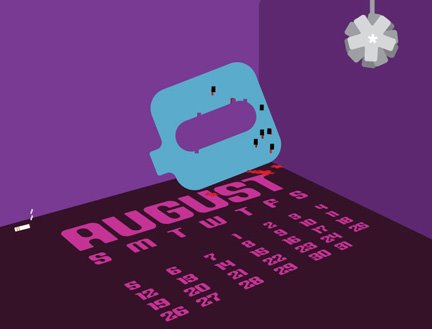
for our typographic calendar assignment, i'm hoping this will work for august.
Wednesday, October 04, 2006
Monday, October 02, 2006
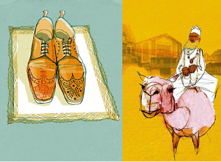
Ian Murray and Alex Green
I was leafing through "People Management" an HR magazine from the UK that sometimes features great illustrations.
i found a larger website
website with his work on it.
Alex Green's work is very beautiful, and looks clean and draft-like at the same time.
his website is alex-green-illustration.co.uk
i found a larger website
website with his work on it.
Alex Green's work is very beautiful, and looks clean and draft-like at the same time.
his website is alex-green-illustration.co.uk
Sunday, October 01, 2006
Wednesday, September 27, 2006
awesome paper art by Megan Brain
one day, when i wasn't looking at the internet during class, i stumbled across this artist's blog and work. you should check Megan Brain's site
kill yr babies
on monday night, i saw Iconologic's Matt Rollens and Elise Thomason give a presentation on design and their work for the Torino Olympics hosted by SCAD's AIGA student group. Once i got over how beautiful the bathrooms were (framed artwork with labels!), i focused on the lecture.
to design for the Games, they had six years, but had to incorporate another person's logo. they showed some initial ideas and sketchbook images.
Matt talked about the design process in general, the following notes are from his speech:
A. Find a story
1. Dump preconcepti0ns
2. Ask dumb questions and listen closely to answers
3. Be naive
4. Collect every piece of evidence
5. Obsessively categorize, chart, list and display the evidence
--just hang out and get some coffee
6. What's the story?
7. Write the story in words.
8. ask, "What's the point of the story?"
9. Make a koan* of your answer.
10. Put all this on paper and call it the "Creative Brief"
B. Design the story
1. Spout ideas, judge them later
2. Steal, cross-polinate and sleep around.
--turn bad ideas into genius
3. Coddle your ideas like beautiful, perfect babies.
4. Kill your babies and try again.
5. There are infinite options and a lot of them suck
6. Don't avoid the obvious; make it new.
7. Think symbolically, metaphorically, and historically.
8. Don't think at all.
9. Say it aloud.
10. Tell the truth.
C. Tell the story
1. It doesn't have to be linear or complete/consistant
2. Stories have to be interesting--they ask you to make connections to the core idea.
-----------------------
*(koan: a paradox to be meditated upon that is used to train Zen Buddhist monks to abandon ultimate dependence on reason and to force them into gaining sudden intuitive enlightenment
--merriam-webster.com)
Wednesday, September 20, 2006
final ripped
writing, washing, and writing on my arm for a while last night, but i think it turned out well. rather unlike things i've done before, but it feels rock and roll.
Sunday, September 17, 2006
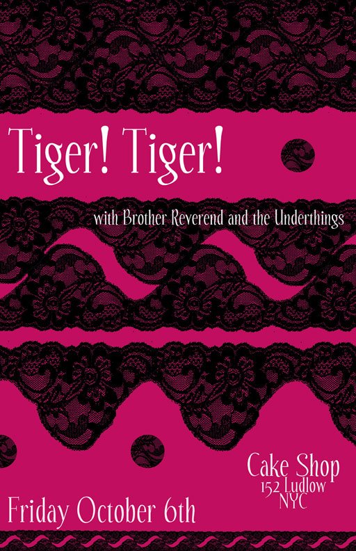
other two poster ideas
i did this bright one early on but may not use it after all.
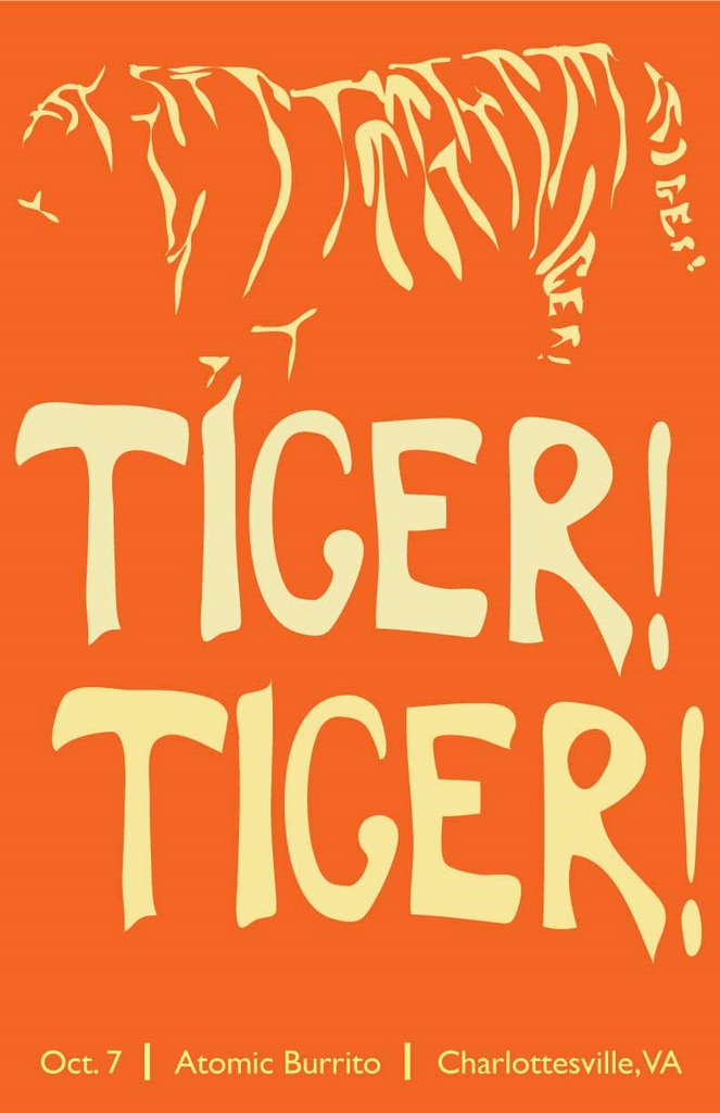
another one with the tiger stripes:
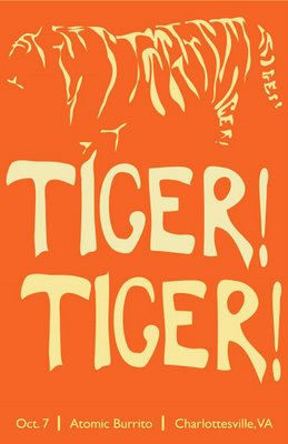

another one with the tiger stripes:
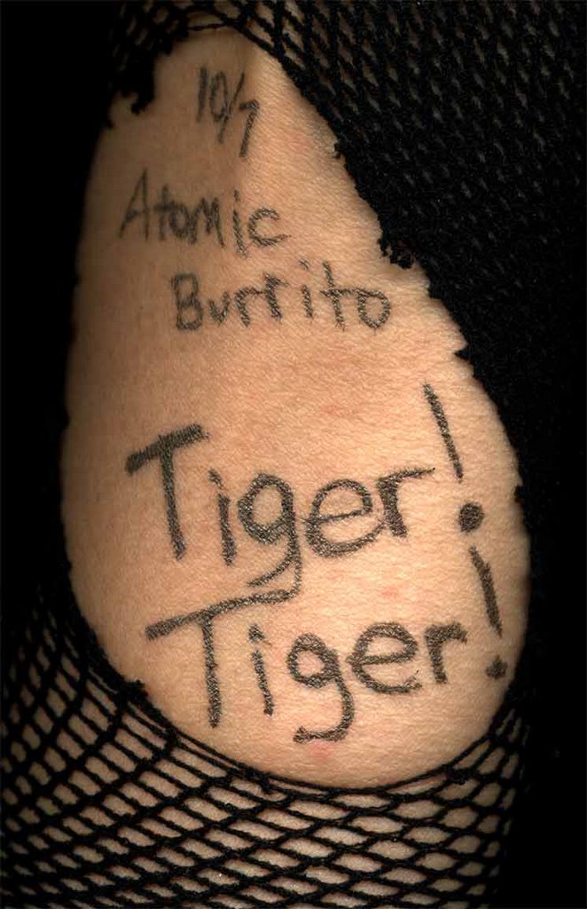
ripped!
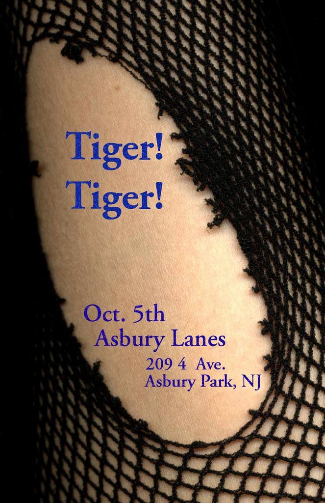
after seeing Tiger! Tiger! last night, I knew I had to do at least one poster with fishnets. I think the classy,sparkly type creates a nice touch.
Tuesday, September 12, 2006
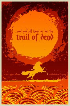
another neat poster
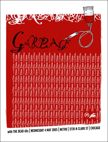
still looking around at some neat posters. this guy, steve sleeve (what a slick name) designed this for garbage. a classmate told me this site where they have great stuff gigposters.com>
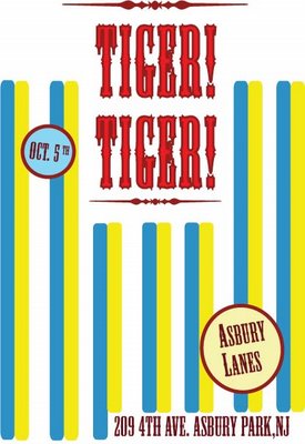
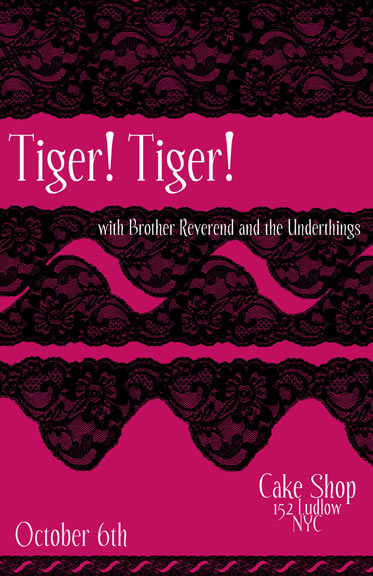
tigers and old lace
one of the poster designs for Tiger! Tiger!
i swear, i go to bed repeating that name over and again.
Monday, September 11, 2006
type of game
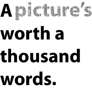
here's my favorite three of the in-class assignment. we're trying to make these sayings come alive with typography.
if you look super close, "picture" is made up of many many "words"
if you look super close, "picture" is made up of many many "words"


Thursday, September 07, 2006
cool posters by todd slater
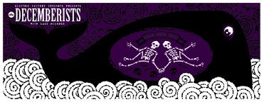
been looking at concert posters a lot lately and i love some of these by todd slater.
you can check him out at his website
velcom to my vorld
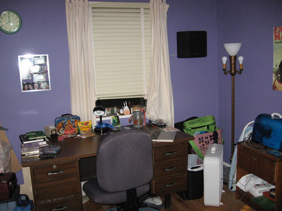
in the past few years, i've upgraded from working on the floor to having lots of luxurious space. the spare bedroom serves as my studio, walls painted with a version of color that disney calls "enchantment"
i also hop back and forth between the
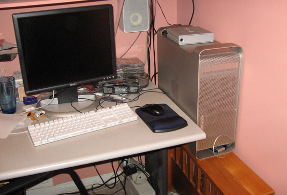 computer and the dining room table. they're right next to each other, so i can sketch and scan, or just plan out my designs shorthand.
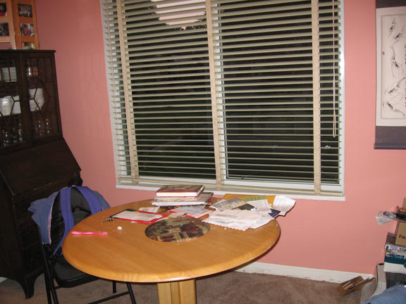
Saturday, September 02, 2006
self-portrait
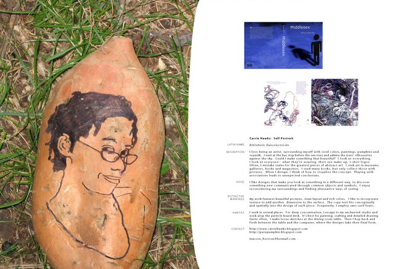
it was real fun making this self-portrait, too bad i couldn't eat it afterwards. nothing like good sweet potato pie.
Sunday, August 27, 2006
not the greatest layout
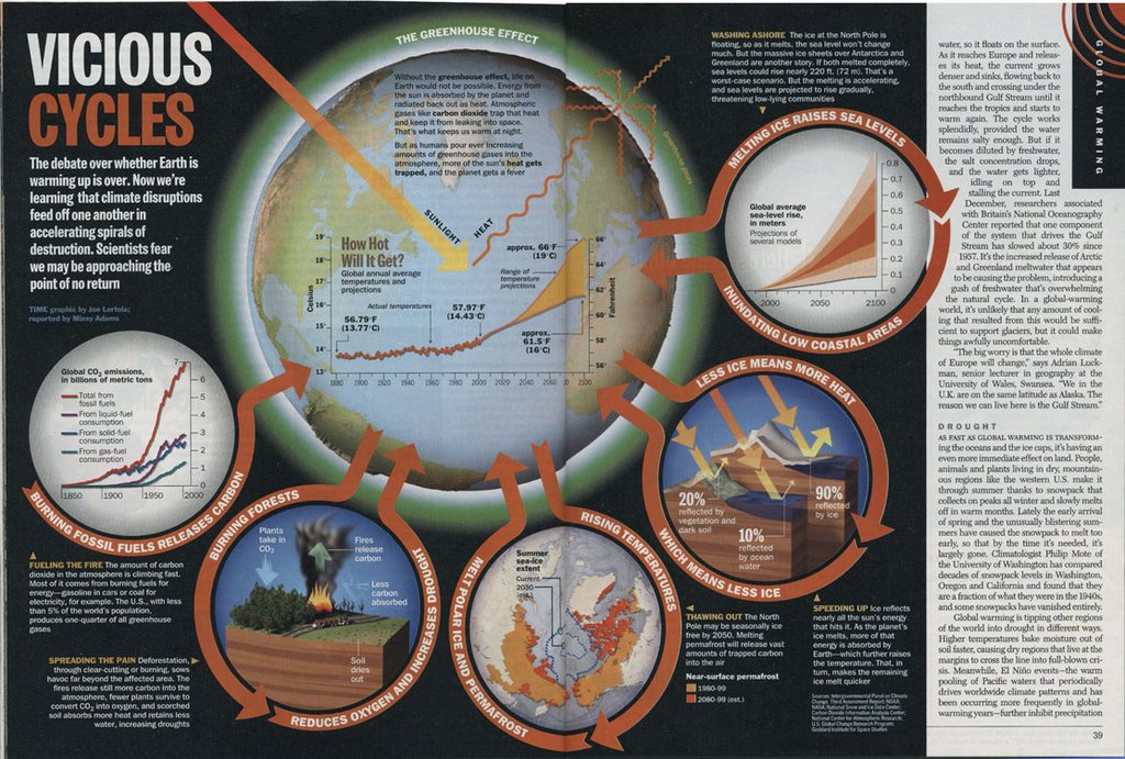
this interesting article could have been improved by including better graphics. instead of helping the reader understand what's going on with the environment, the repetition of orange circles, arrows coming in and going out, make me confused.
Tuesday, August 22, 2006
one more
i have no idea who designed this cover and most of it has worn off, but the text is just beautiful.
Subscribe to:
Posts (Atom)